The Power of Minimalism in Enterprise Design
When Too Much Becomes Too Little
Enterprise platforms often boast of being “feature-rich.” They promise endless options, dashboards, and tools. But when every function is placed in front of users at once, the result isn’t power - it’s paralysis. Employees feel overwhelmed, productivity dips, and adoption stalls.
This is where minimalism in enterprise design emerges as a game-changer. Minimalism isn’t about removing features; it’s about structuring information in a way that reduces cognitive load, increases clarity, and empowers users to achieve their goals without distraction.
In enterprise UX, minimalism clarifies the user interface and streamlines digital dashboards. This commitment to design simplicity upgrades corporate tools for faster adoption and better outcomes.
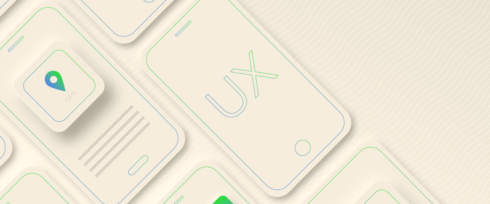
.png)

What Minimalism Really Means in Enterprise UX
Minimalism has often been misunderstood as “plain” or “empty.” In enterprise design, minimalism is:
- Purposeful Design:Every element must justify its existence.
- Clarity of Hierarchy: Important tasks are surfaced; secondary ones are tucked away.
- Visual Breathing Space: White space reduces fatigue and improves readability.
- Consistency: Reusable components and styles eliminate confusion.
In short, minimalism means doing more with less clutter.
“Minimalism in design is not about less - it’s about clarity and purpose.”
Why Enterprise Systems Struggle with Minimalism
- Legacy Mindsets: Many platforms are still influenced by “more features = more value.”
- Complex Workflows: Enterprise systems often serve multiple departments, making focus difficult.
- Data Overload: Dashboards attempt to present everything at once.
- Resistance to Change: Stakeholders fear minimalism may “hide” functions.
But the reality is, a cluttered system doesn’t serve anyone well. By overwhelming users, enterprises reduce adoption - the exact opposite of what they intended.
Benefits of Minimalism in Enterprise Design
-
Reduces Cognitive Load
Employees juggling dozens of tasks don’t have time to hunt through cluttered menus. Minimalist design ensures they find what they need quickly.
-
Increases Adoption
If an interface is intuitive, users are more likely to embrace it. Simplified dashboards accelerate onboarding for new employees.
-
Boosts Productivity
Minimalism cuts through noise, allowing users to focus on high-value actions. This directly improves efficiency.
-
Improves Trust and Confidence
A clean, well-organized interface signals professionalism and reliability — especially important in industries like banking, healthcare, and technology.
Principles of Minimalist Enterprise Design
-
Prioritize User Goals
Start with the most critical tasks. What do users do most frequently? Those should be front and center.
-
Design for Scannability
Use typography, spacing, and color contrast to create visual hierarchy. Dashboards should feel like an open book, not a cluttered puzzle.
-
Use Progressive Disclosure
Don’t show everything at once. Allow users to dive deeper only when needed.
-
Keep Interactions Predictable
Consistency in button placement, navigation, and interactions reduces errors.
-
Leverage Data Visualization Wisely
Charts and metrics should simplify complex information, not overwhelm users with detail.
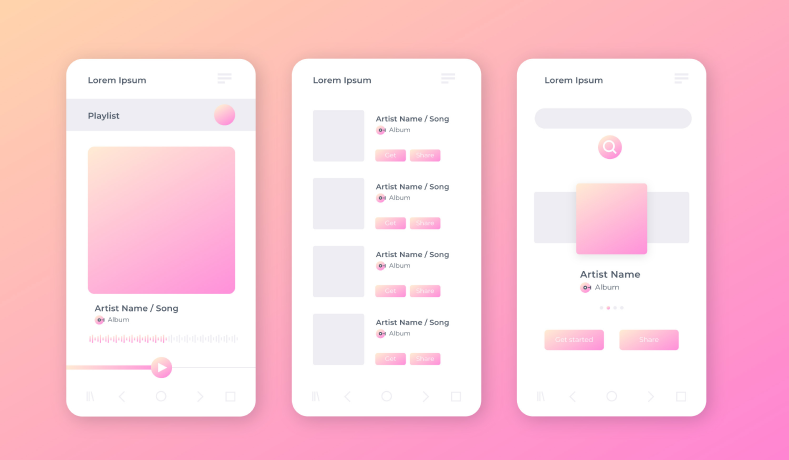
Example: Simplifying a Wealth Management Dashboard
A wealth management platform once displayed 20+ metrics on its home screen. Users—many of them financial advisors - struggled to focus, often missing critical alerts
By applying minimalism, the design team prioritized:
- 3 key metrics (portfolio growth, risk exposure, cash balance)
- A single clear CTA (“View Reports”)
- Supportive visuals with clear hierarchy
The result: faster decision-making, increased advisor confidence, and reduced customer support queries.
Challenges of Minimalism in Enterprise Contexts
- Stakeholder Buy-In: Leaders may equate clutter with completeness.
- Feature Wars: Different departments may compete for dashboard space.
- User Fear: Some users worry that “minimal” means “less powerful.”
Overcoming these challenges requires communication: showing stakeholders how clarity drives adoption and ROI.
Minimalism and the Future of Enterprise Design
As AI and automation take over repetitive tasks, dashboards will focus less on raw data and more on actionable insights. Minimalism will become not just an aesthetic choice,but a necessity to present information in a way that humans can process quickly.
Expect to see:
- Dashboards surfacing “just-in-time” insights
- Interfaces adapting dynamically to user roles
- Visual languages that prioritize speed and clarity over decoration
Clarity Is Power
Enterprise design is at a crossroads. Companies can continue overwhelming employees with clutter, or they can embrace minimalism to empower them.
Minimalism doesn’t mean less functionality. It means purposeful clarity. In enterprise design, that clarity translates into higher adoption, better productivity, and more confident decision-making
In the end, the most powerful enterprise systems are not the ones that show everything - they’re the ones that show exactly what matters.


Related posts

Marketing / Strategy

Marketing / Strategy
Start Unique Experience.

Marketing / Strategy